페이지들을 구현하기 전에 공용 컴포넌트들을 만들어 두기로 했다.
스토리북을 쓰면 만든 컴포넌트들을 미리보기의 형태로 정리해 놓을 수 있어서 함께 사용하기로!
처음 storybook을 설치하면 작성되어있는 main.ts 이다.
import type { StorybookConfig } from '@storybook/nextjs'

const config: StorybookConfig = {
  stories: ['../src/**/*.mdx', '../src/**/*.stories.@(js|jsx|mjs|ts|tsx)'],
  addons: [
    '@storybook/addon-links',
    '@storybook/addon-essentials',
    '@storybook/addon-onboarding',
    '@storybook/addon-interactions',
    '@storybook/addon-mdx-gfm'
  ],
  framework: {
    name: '@storybook/nextjs',
    options: {},
  },
  docs: {
    autodocs: 'tag',
  },
}
export default config
이 프로젝트에서는 storybook도 vanilla extract 형식의 css를 읽어내야 하기 때문에 이 main.ts파일을 수정해야 한다.
npm install -D @vanilla-extract/webpack-plugin css-loader mini-css-extract-plugin style-loader
import type { StorybookConfig } from '@storybook/nextjs';

import { VanillaExtractPlugin } from "@vanilla-extract/webpack-plugin";
import MiniCssExtractPlugin from "mini-css-extract-plugin";

const config: StorybookConfig = {
  stories: ['../src/**/*.mdx', '../src/**/*.stories.@(js|jsx|mjs|ts|tsx)'],
  addons: [
    '@storybook/addon-links',
    '@storybook/addon-essentials',
    '@storybook/addon-onboarding',
    '@storybook/addon-interactions',
    '@storybook/addon-styling-webpack',
    ({
      name: "@storybook/addon-styling-webpack",
      options: {plugins: [new VanillaExtractPlugin(), new MiniCssExtractPlugin()],
        rules: [{
// css 파일 처리 규칙 1// Vanilla Extract에서 생성된 CSS 파일을 제외하고, style-loader 및 css-loader를 사용하여 CSS 파일을 모듈로 변환 및 번들링.
      test: /\\.css$/,
      sideEffects: true,
      use: [
          require.resolve("style-loader"),
          {
              loader: require.resolve("css-loader"),
              options: {},
          },
      ],exclude: /\\.vanilla\\.css$/,
    },{
// css 파일 처리 규칙 2// Vanilla Extract에서 생성된 CSS 파일을 MiniCssExtractPlugin.loader 및 css-loader를 사용하여 CSS 파일을 번들링하고 추출.
    test: /\\.vanilla\\.css$/i,
    sideEffects: true,
    use: [
      MiniCssExtractPlugin.loader,
      {
          loader: require.resolve('css-loader'),
          options: {
// Required as image imports should be handled via JS/TS import statements
              url: false,
          },
      },
    ],
    },],
      }
    })
  ],
  framework: {
    name: '@storybook/nextjs',
    options: {},
  },
  docs: {
    autodocs: 'tag',
  },
};
export default config;
public 폴더 속 svg파일을 불러와 로딩 컴포넌트로 사용하기 위해 tsconfig에서 작성한 TypeScript의 절대 경로를 해석할 수 있도록 설정하고, svg파일을 읽기 위한 webpack 규칙도 추가했다.
...그럼 이제 만들어야 할 공용 컴포넌트들!
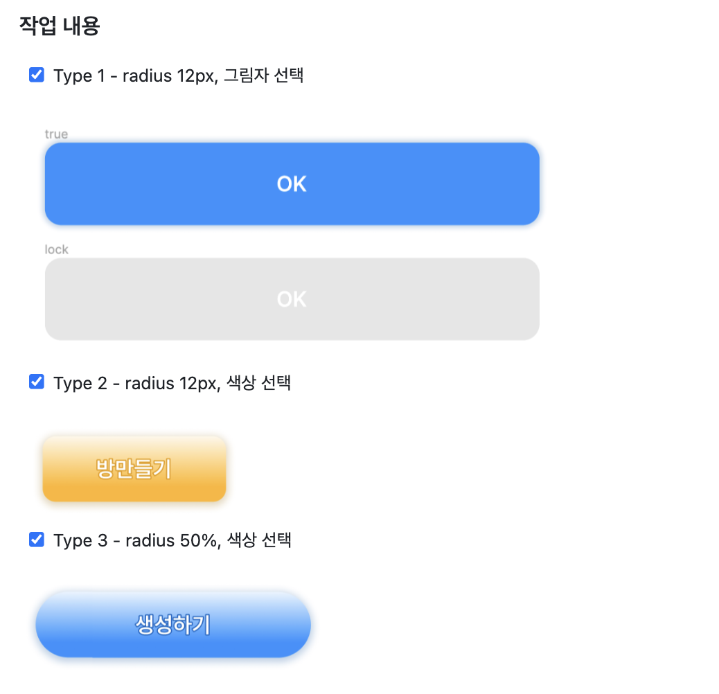
세 타입으로 분류를 하긴 했는데 type2,3의 차이가 border radius밖에 없어서 SolidButton, Grad(ient)Button 두가지로만 분류해 만들기로 했다.
SolidButton은 그림자 유무와 fullWidth(width: 100%)를 적용할 건지를 옵션으로 받고 버튼의 상태가 isLoading 또는 disabled인지에 따라 스타일링을 달리 해준다.
GradButton은 버튼 색상, 모서리 둥글기, fullWidth를 옵션으로 받고 나머지 동일!
그리고 기본 버튼과 같은 역할을 할 수 있도록 button 태그가 받는 props들을 거의 다 가져오면 된다.
그래서 나온 SolidButtonProps 와 GradButtonProps 타입
export type SolidButtonProps = {
  disabled?: boolean;
  form?: string;
  formaction?: string;
  formenctype?: string;
  formmethod?: string;
  formnovalidate?: boolean;
  formtarget?: string;
  name?: string;
  type?: 'button' | 'submit' | 'reset';
  value?: string;
  children?: React.ReactNode;
  onClick?: () => void;
  isLoading?: boolean;
  shadowExist?: boolean;
  fullWidth?: boolean;
};

export type GradButtonProps = {
  disabled?: boolean;
  form?: string;
  formaction?: string;
  formenctype?: string;
  formmethod?: string;
  formnovalidate?: boolean;
  formtarget?: string;
  name?: string;
  type?: 'button' | 'submit' | 'reset';
  value?: string;
  children?: React.ReactNode;
  onClick?: () => void;
  isLoading?: boolean;
  rounded?: boolean;
  fullWidth?: boolean;
  color?: 'primary' | 'secondary';
};
여기에 vanilla-extract의 recipe 함수를 이용하면 조건에 따라 여러 스타일을 선택적으로 적용시킬 수 있다.
https://vanilla-extract.style/documentation/packages/recipes/#recipe
Recipes — vanilla-extract
Zero-runtime Stylesheets-in-TypeScript.
vanilla-extract.style
// SolidButton.css.ts

import { recipe } from '@vanilla-extract/recipes';
import { globals } from '../globals.css';

export const solidButton = recipe({
  base: {
    minHeight: 60,
    position: 'relative',
    display: 'flex',
    justifyContent: 'center',
    alignItems: 'center',
    padding: '18px 18px',
    borderRadius: 12,
    backgroundColor: globals.color.blue_main,
    color: '#FFFFFF',
    fontWeight: '600',
    cursor: 'pointer',
    transition: 'background-color 0.2s, box-shadow 0.2s, transform 0.2s',
    ':active': {
      transform: 'scale(0.99)',
    },
  },
  variants: {
    shadowExist: {
      true: {
        boxShadow: '0px 0px 4px 2px rgba(23, 96, 171, 0.25)',
        ':hover': {
          boxShadow: '0px 0px 5px 3px rgba(23, 96, 171, 0.25)',
        },
      },
    },
    fullWidth: {
      true: {
        width: '100%',
      },
    },
    disabled: {
      true: {
        backgroundColor: globals.color.black_6,
        cursor: 'default',
        boxShadow: 'none',
        ':hover': {
          boxShadow: 'none',
        },
        ':active': {
          transform: 'none',
        },
      },
    },
    isLoading: {
      true: {
        cursor: 'default',
        pointerEvents: 'none',
      },
    },
  },
});
// GradButton.css.ts
import { recipe } from '@vanilla-extract/recipes';
import { globals } from '../globals.css';
export const gradButton = recipe({
base: {
minHeight: 60,
position: 'relative',
display: 'flex',
justifyContent: 'center',
alignItems: 'center',
padding: '18px 18px',
borderRadius: 12,
color: '#FFFFFF',
fontWeight: '600',
cursor: 'pointer',
transition: 'background-color 0.2s, box-shadow 0.2s, transform 0.2s',
':active': {
transform: 'scale(0.99)',
},
},
variants: {
color: {
primary: {
background: `linear-gradient(180deg, rgba(38, 146, 255, 0.10) 0%, #2692FF 77.5%)`,
boxShadow: '0px 2px 8px 2px rgba(23, 96, 171, 0.30)',
':hover': {
boxShadow: '0px 3px 8px 3px rgba(23, 96, 171, 0.30)',
},
textShadow: `1px 1px 1px ${globals.color.blue_stroke},
-1px -1px 1px ${globals.color.blue_stroke},
1px -1px 1px ${globals.color.blue_stroke},
-1px 1px 1px ${globals.color.blue_stroke}`,
},
secondary: {
background:
'linear-gradient(180deg, rgba(255, 181, 38, 0.10) 0%, #FFB526 77.5%)',
boxShadow: '0px 2px 8px 2px rgba(169, 121, 29, 0.30)',
':hover': {
boxShadow: '0px 3px 8px 3px rgba(169, 121, 29, 0.30)',
},
textShadow: `1px 1px 1px ${globals.color.sub_stroke},
-1px -1px 1px ${globals.color.sub_stroke},
1px -1px 1px ${globals.color.sub_stroke},
-1px 1px 1px ${globals.color.sub_stroke}`,
},
},
rounded: {
true: {
borderRadius: 30,
padding: '18px 24px',
},
},
fullWidth: {
true: {
width: '100%',
},
},
disabled: {
true: {
background: `linear-gradient(180deg, rgba(230, 230, 230, 0.10) 0%, #DEDEDE 77.5%)`,
cursor: 'default',
boxShadow: 'none',
':hover': {
boxShadow: 'none',
},
':active': {
transform: 'none',
},
textShadow: `1px 1px 1px ${globals.color.black_4},
-1px -1px 1px ${globals.color.black_4},
1px -1px 1px ${globals.color.black_4},
-1px 1px 1px ${globals.color.black_4}`,
},
},
isLoading: {
true: {
cursor: 'default',
pointerEvents: 'none',
},
},
},
});
이렇게 만든 recipe 스타일의 css를 적용한 최종 SolidButton과 GradButton!
// GradButton.tsx

import { SolidButtonProps } from '@/app/_types/SolidButtonProps';
import * as styles from './SolidButton.css';
import LoadingCircular from './LoadingCircular';

const SolidButton = ({
  disabled,
  form,
  formaction,
  formenctype,
  formmethod,
  formnovalidate,
  formtarget,
  name,
  type,
  value,
  children,
  onClick,
  isLoading,
  shadowExist = true,
  fullWidth = false,
}: SolidButtonProps) => {
  return (
    <button
      type={type}
      form={form}
      formAction={formaction}
      formEncType={formenctype}
      formMethod={formmethod}
      formNoValidate={formnovalidate}
      formTarget={formtarget}
      name={name}
      value={value}
      disabled={disabled || isLoading}
      onClick={onClick}
      className={styles.solidButton({
        shadowExist,
        fullWidth,
        isLoading,
        disabled,
      })}
    >
      {children}
      {isLoading && (
        <div className={styles.loadingContainer}>
          <LoadingCircular />
        </div>
      )}
    </button>
  );
};

export default SolidButton;
// SolidButton.tsx
import React from 'react';
import { SolidButtonProps } from '@/app/_types/SolidButtonProps';
import * as styles from './SolidButton.css';
import LoadingCircular from './LoadingCircular';
const SolidButton = ({
disabled,
form,
formaction,
formenctype,
formmethod,
formnovalidate,
formtarget,
name,
type,
value,
children,
onClick,
isLoading,
shadowExist = true,
fullWidth = false,
}: SolidButtonProps) => {
return (
<button
type={type}
form={form}
formAction={formaction}
formEncType={formenctype}
formMethod={formmethod}
formNoValidate={formnovalidate}
formTarget={formtarget}
name={name}
value={value}
disabled={disabled || isLoading}
onClick={onClick}
className={styles.solidButton({
shadowExist,
fullWidth,
isLoading,
disabled,
})}
>
{children}
{isLoading && (
<div className={styles.loadingContainer}>
<LoadingCircular />
</div>
)}
</button>
);
};
export default SolidButton;
+ recipe함수를 알기 전엔 이렇게 스타일을 각각 선언한 뒤에 연산자로 템플릿 문자열을 조합했었는데... 훨씬 코드가 깔끔해졌다!
// recipe 적용전 GradButton

<button
  type={type}
  form={form}
  formAction={formaction}
  formEncType={formenctype}
  formMethod={formmethod}
  formNoValidate={formnovalidate}
  formTarget={formtarget}
  name={name}
  value={value}
  disabled={disabled || isLoading}
  onClick={onClick}
  className={`
    ${styles.gradButton}
    ${rounded && styles.rounded}
    ${fullWidth && styles.fullWidth}
    ${isLoading && `${styles.disabled} ${styles.loading}`}
    ${disabled && styles.disabled}
    ${color === 'primary' ? styles.primary : styles.secondary}
  `}
>
  {children}
  {isLoading && (
    <div className={`${styles.loadingContainer}`}>
      <LoadingCircular />
    </div>
  )}
</button>
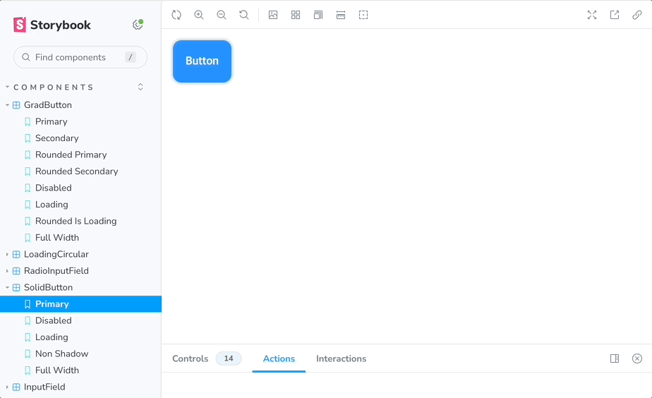
마지막으로 스토리북을 위한 파일들을 작성해주면
// GradButton.stories.tsx

import { Meta, StoryObj } from '@storybook/react';
import GradButton from './GradButton';

const meta = {
  title: 'Components/GradButton',
  component: GradButton,
  argTypes: {
    disabled: { control: 'boolean' },
    form: { control: 'text' },
    formaction: { control: 'text' },
    formenctype: { control: 'text' },
    formmethod: { control: 'text' },
    formnovalidate: { control: 'boolean' },
    formtarget: { control: 'text' },
    name: { control: 'text' },
    type: { control: 'text' },
    value: { control: 'text' },
    onClick: { action: 'clicked' },
    isLoading: { control: 'boolean' },
    color: { control: 'inline-radio', options: ['primary', 'secondary'] },
    fullWidth: { control: 'boolean', defaultValue: false },
  },
} satisfies Meta<typeof GradButton>;

export default meta;
type Story = StoryObj<typeof meta>;

export const Primary: Story = {
  args: {
    children: 'Primary Button',
  },
};

export const Secondary: Story = {
  args: {
    children: 'Secondary Button',
    color: 'secondary',
  },
};

export const RoundedPrimary: Story = {
  args: {
    children: 'Rounded Primary Button',
    rounded: true,
  },
};

export const RoundedSecondary: Story = {
  args: {
    children: 'Rounded Secondary Button',
    rounded: true,
    color: 'secondary',
  },
};

export const Disabled: Story = {
  args: {
    children: 'Disabled Button',
    disabled: true,
  },
};

export const Loading: Story = {
  args: {
    children: 'Loading Button',
    isLoading: true,
  },
};

export const RoundedIsLoading: Story = {
  args: {
    children: 'Rounded Loading Button',
    rounded: true,
    isLoading: true,
  },
};

export const FullWidth: Story = {
  args: {
    children: 'FullWidth Button',
    fullWidth: true,
  },
};
이제 각 페이지에 맘 편히 가져다 쓰면 된다!
'Front-End' 카테고리의 다른 글
| [React / Next.js + Zustand] StompJS로 채팅 구현하기 (2) - 실시간 채팅 방 상태 관리하기 (2) | 2024.04.05 |
|---|---|
| [React / Next.js] StompJS로 채팅 구현하기 (1) - 웹 소켓 연결 (0) | 2024.03.29 |
| Next.js에서 Axios Interceptor 작성하기 (feat. Zustand, localStorage) (1) | 2024.03.23 |
| [Peer 스터디] 웹 접근성에 대해 알아보자... (0) | 2024.03.15 |
| 컴포넌트 랜덤 분포 애니메이션 구현하기 (0) | 2024.03.08 |

